Welcome to our latest Project Roundup!
While the Geeks always seem to have plenty of irons in the fire, we like to cool off every now and then to reflect on what we’ve accomplished—together and for our clients.
Who’s up in this Roundup:
★ Did you know? We feature a new project every month in our monthly newsletter “The Geek Beat.”
—> Not signed up yet? Subscribe here!
Piston Foundation
About the WebAwards:
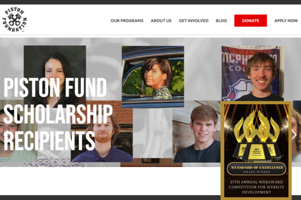
The WebAward competition is the premier award recognition program for website developers and the online marketing community.
The project deets:
Piston Foundation is a nonprofit helping to build a new generation of automotive tradespeople through their scholarship and apprenticeship programs.
For this website project, the Geeks provided:
✅ Custom design, resulting in a cohesive brand identity for the entire site
✅ Pages and galleries built using our CodeGeek Blocks Plugin
✅ Clear organization and messaging to appeal to two distinct audiences
Our fave feature: Donate UX!
We put our geeky heads together to determine the best UX (user experience) for someone who wants to donate to the Piston Foundation.
When a user selects one of the dropdown options from the “Donate” menu, their form is pre-loaded with information based on what they selected:
- Donate once
- Donate monthly
- Become a founder
- Donate a car or parts
After 2-3 clicks, they’re onto the payment portal! 🙌

Learn more about Piston Foundation and check out their new website at: pistonfoundation.org
International Weed Genomics Consortium
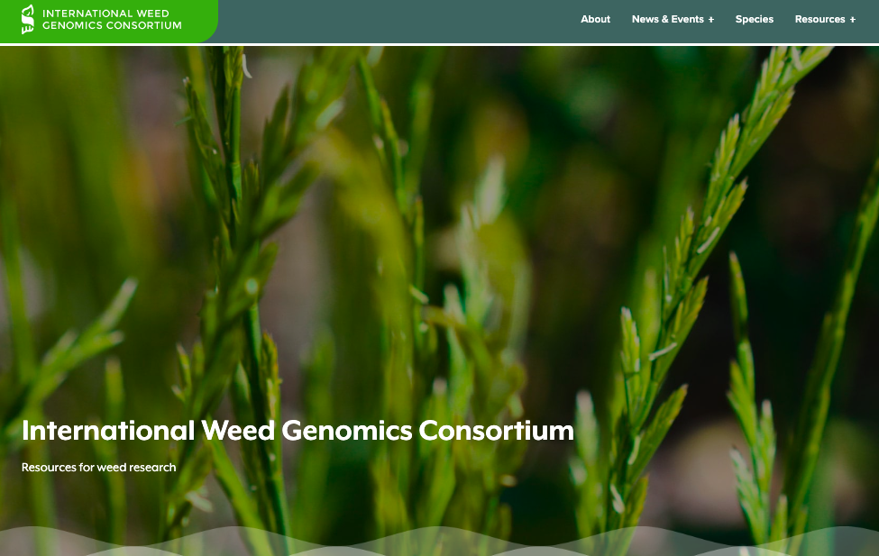
The International Weed Genomics Consortium (IWGC) provides a platform for private and public collaboration to develop genomic tools and resources and to stimulate global research in weed biology and management.
The project deets:
✅ Converted from a Python app to a custom-designed website!
✅ Built almost entirely with the Gutenberg Block Editor
✅ Needs to serve as a meaningful resource for multiple audiences, including researchers, startups, government agencies and amateur scientists
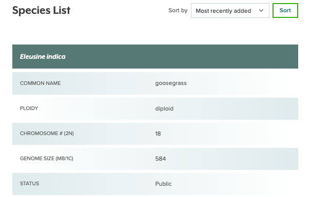
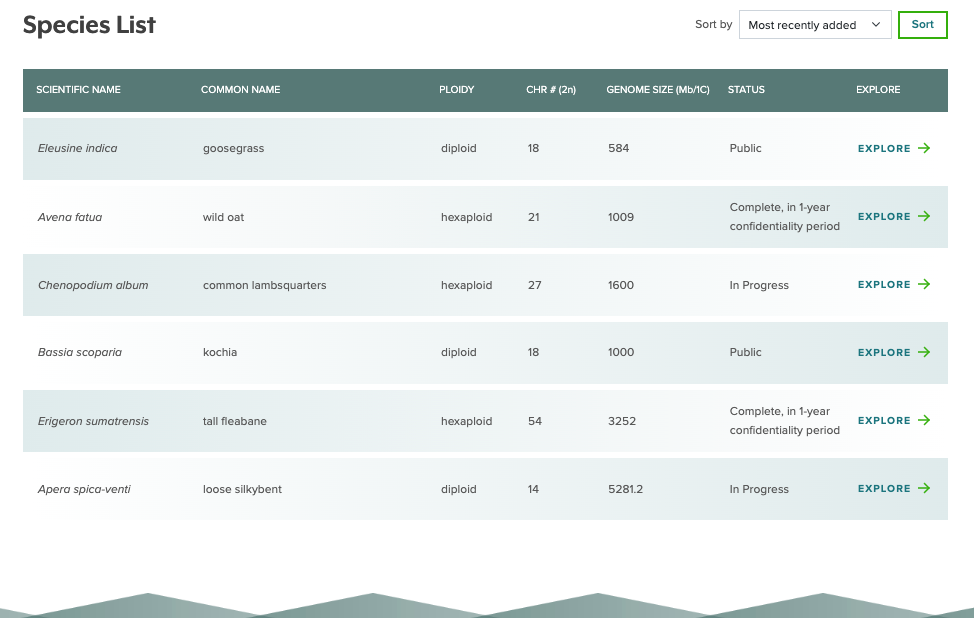
Our fave feature: Weed species tables!
IWGC’s weed species tables contain lots of dense info. 🧐
So we put our Geeky heads together and came up with a solution that not only presents that data clearly, but also works seamlessly on both desktop and mobile devices.
Learn more about the International Weed Genomics Consortium and check out their new website at: weedgenomics.org
Pollock Tax & Accounting

Located in Fort Collins, CO, Pollock Tax & Accounting provides small businesses and individuals with custom tax preparation, payroll and bookkeeping services.
The project deets:
✅ Website redesign in the WordPress CMS
✅ Modernize the site’s look and feel with an updated logo and custom icons
✅ Simplify the overall content structure, making it a breeze for clients to find what they need
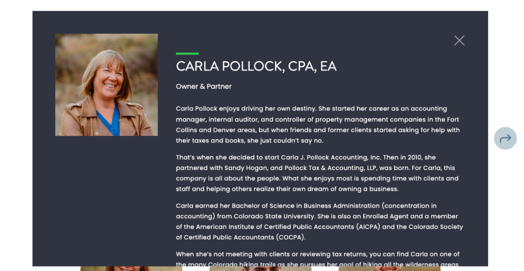
Our fave feature: Accessible team bios!
Pollock’s team specializes in cultivating client relationships based on trust.
To help facilitate that, we knew their Team page needed to be accessible for as many website visitors as possible.
So we built a pop-up slider system for their team bios that is:
🎯 keyboard navigable
🎯 screen reader friendly
Learn more about the Pollock Tax & Accounting and check out their new website at: ptallp.com

